
A decade later, these 2017 Bollywood posters remain iconic examples of how brilliant design amplifies a film's narrative and cultural impact.
Why These 2017 Posters Mattered
The finest Bollywood posters transcend marketing—they become cultural artifacts. The selections from 2017 demonstrate how thoughtful design, bold messaging, and visual creativity can amplify a film’s themes and resonate with audiences long after release. Each poster tells its own story before the credits ever roll.
My friend has a huge theatrical poster of the much celebrated ‘Dilwale Dulhaniya Le Jayenge’, framed and hanging in her living room. And that had me wondering how an amazing poster adds ten pounds to our inclination of booking that ticket. A good, appealing poster not only markets a film and its properties for the best but also remains etched in minds and living rooms of many.
This stands as a tribute to all the great posters of the year 2017:
Lipstick Under My Burkha (One Of the Best Poster):
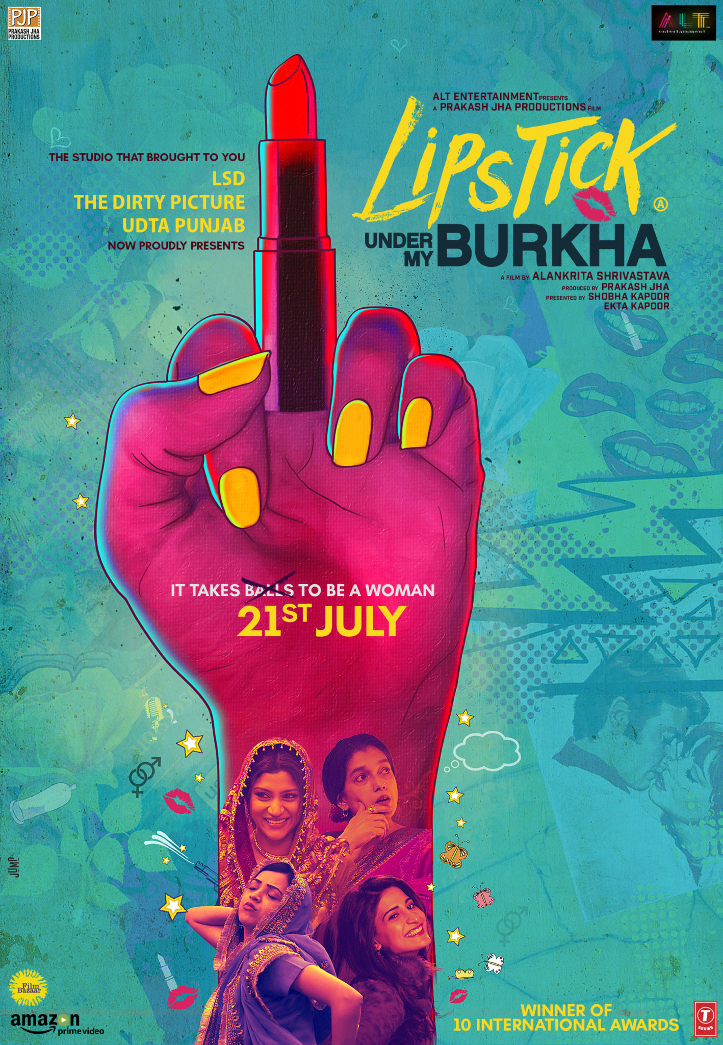
In bright, flamboyant colours and a subtly wild background, the controversial film unveiled its poster with its theme element, lipstick. It spoke of lipstick, a cover-up, a statement; and ‘lipistik wale sapne’ too. The movie that aimed at making a sharp statement through its storyline and characters, advanced its aspirations with the simple marketing of a lipstick to ask the misogyny to Fuck off.
Aam Aadmi Family:
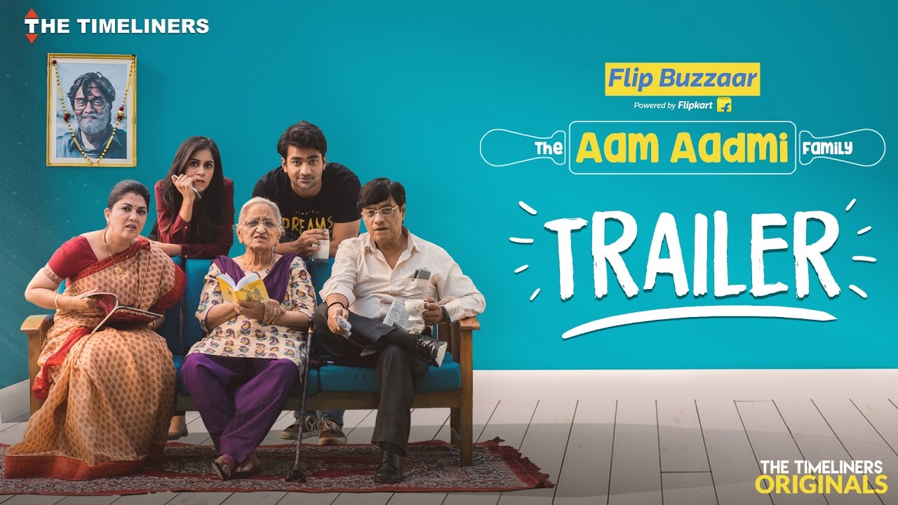
A production of The Timeliners and a sequel in The Aam Aadmi Family series, this one had its poster claiming of all the middle-class aspects of each character of an ‘aam aadmi’ family. The doodle-y touch of the background only adds to the charm of this poster.
Tumhari Sulu:
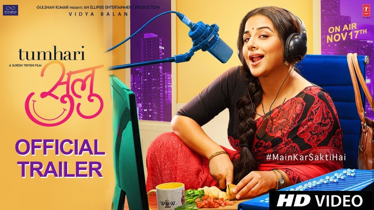
Of course ya, this had to be here ya. Look at Vidya Balan and her slightly curled lips just finishing off a seductive hello that the ‘Sulu next door’ started. This frankly stands out to be the rank one on my list.
Judwaa 2:
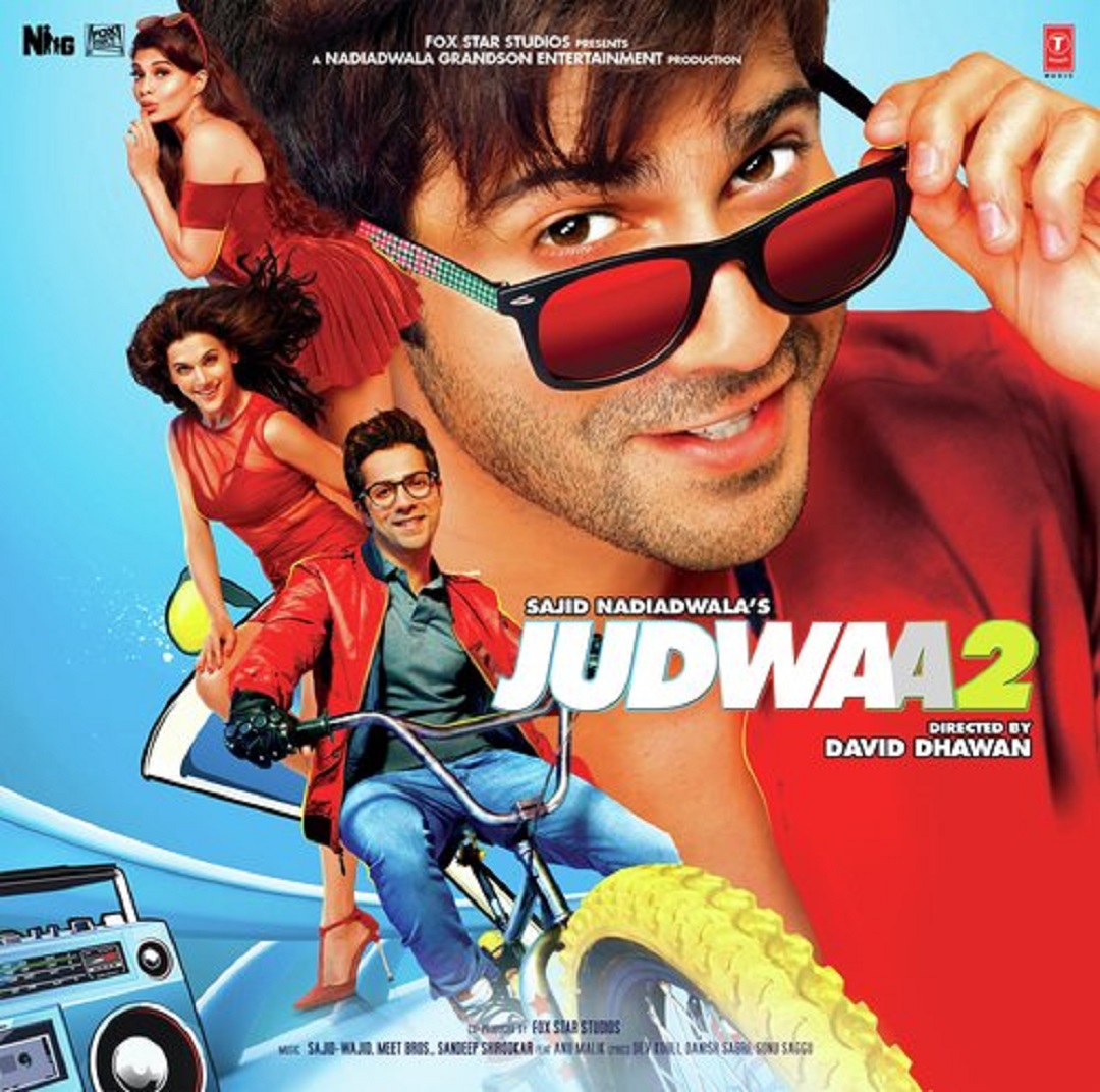
Keeping the pain of watching remakes aside, this poster gives a very retro, 90s feel with the contemporary faces trying the charm. The only ‘Judwaa’ thing about ‘Judwaa 2’ was the poster, and of course the storyline, and… the director.
Jolly LLB 2:
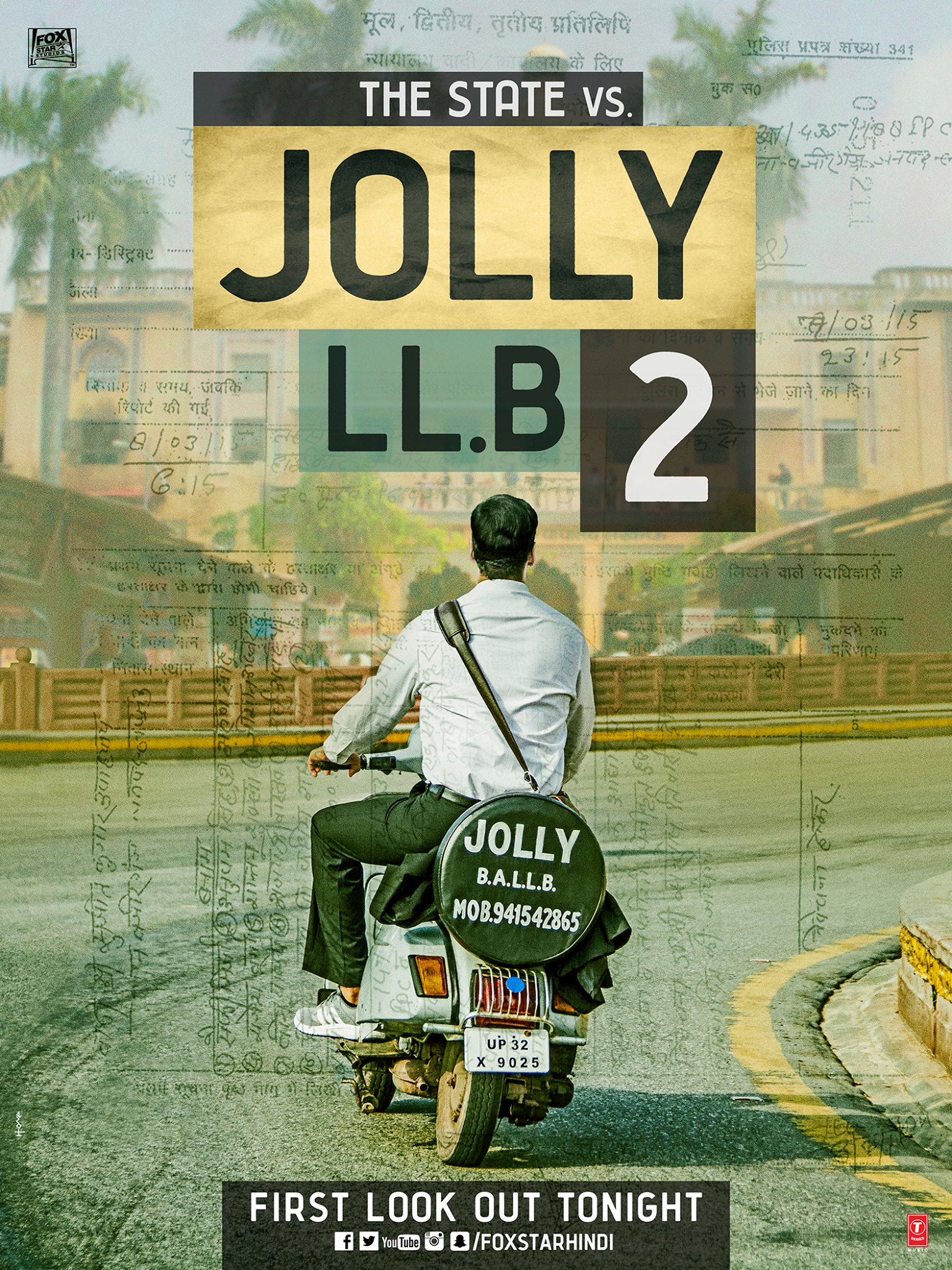
The first look poster of the satire makes the universe of this film very personal. The scooter, the average clothes and self-advertising, it cannot be Akshay Kumar.
What The Folks:
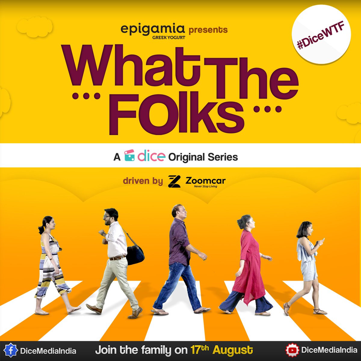
First of all, loved the web series, had to say it. Not to mention, the characters are lovely and the way this image portrays them has a hidden meaning. Do you see what I see?
Toilet Ek Prem Katha:
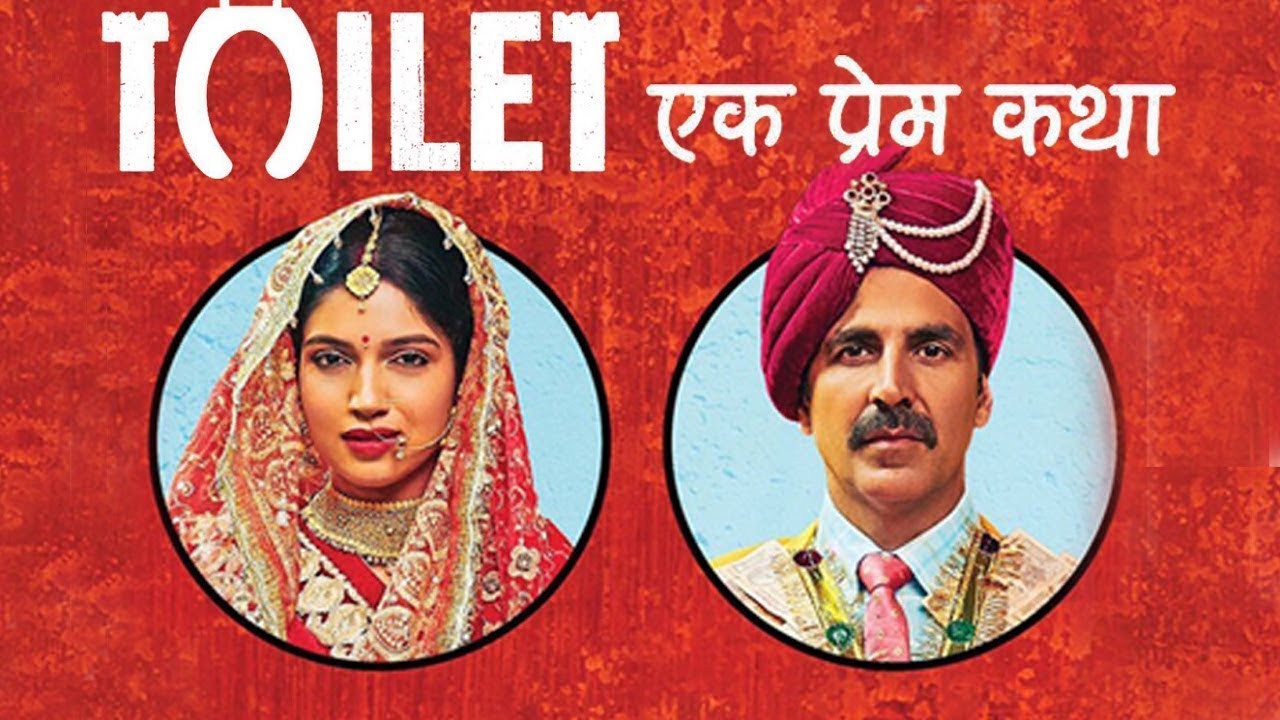
This movie was a surprise. By this first look of the film, it was utterly hard to guess the subject. In no way does the ‘Shochalay-ish’ font of ‘stree’ and ‘purush’ say anything. Does it?
Hindi Medium:
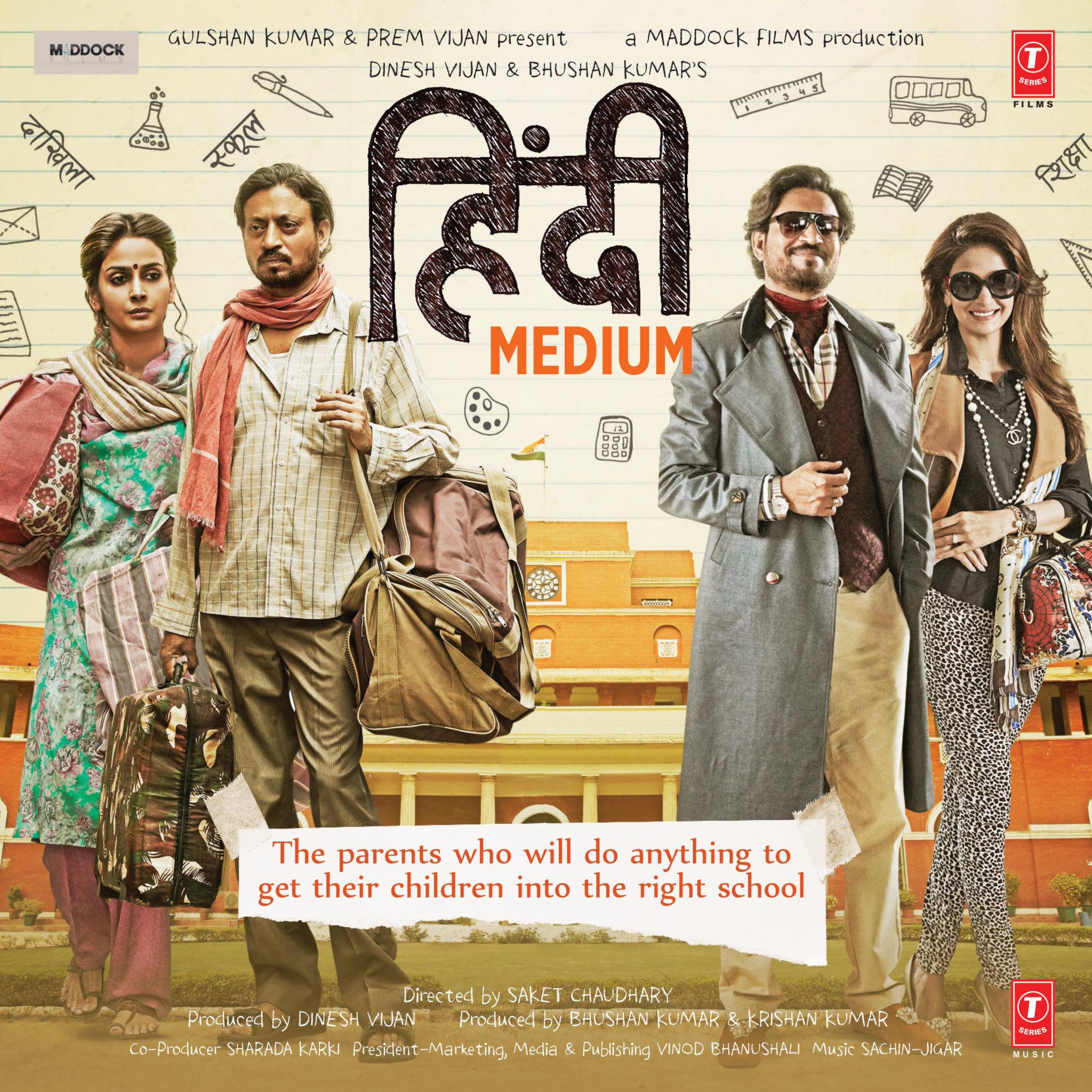
This was my best poster pick. The divide and its contrast are so simple, subtle and obvious. The note only adds to the flavour being the one-liner ‘moral of the story’.
Bareilley Ki Barfi:
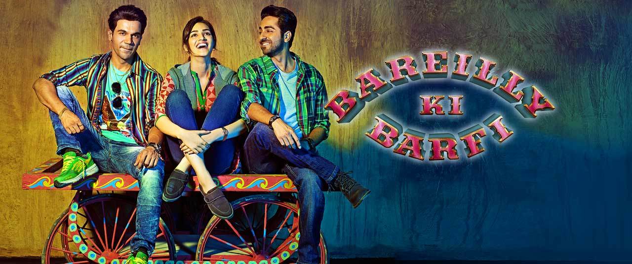
The poster for some reason looks like a lit up street, outside a sweet shop where you’d meet your punters to share a cigarette and tea with. It states no story, just an epitome of a love and friendship relationship among the three. Clearly very coloured, happy and filmy this one.
Bisht, Please!:
To have a best friend like him, Neetu has the worst life and even the poster says that. She could be smiling for all I care but she needs no karma to come back and bite her in the ass.
Rangoon:
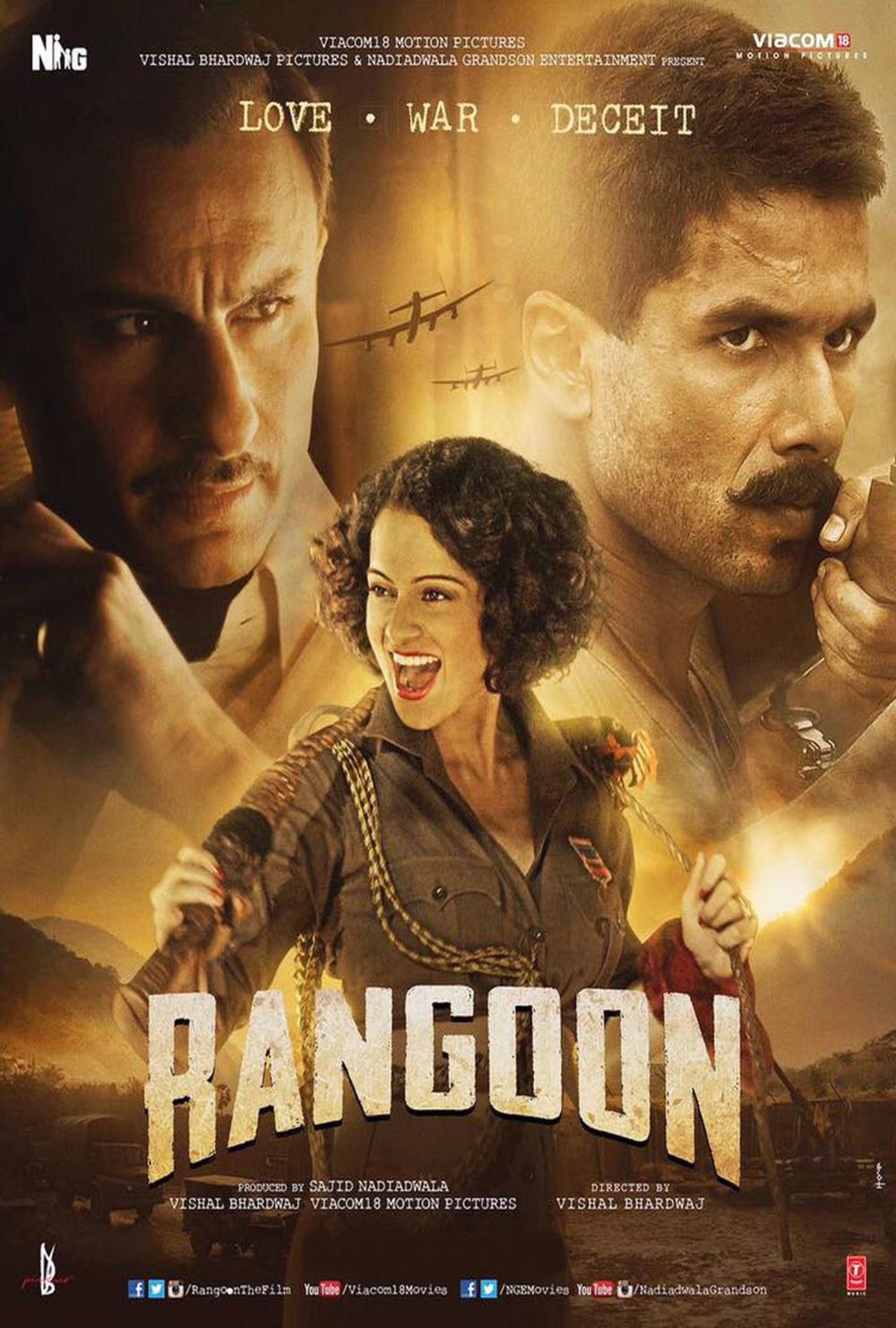
With such a great cast and a nicely layered poster, I wonder why it was only the poster that stood out. The classy, 40s costume and the VSCOCAM filter makes it even more appealing.
Newton:
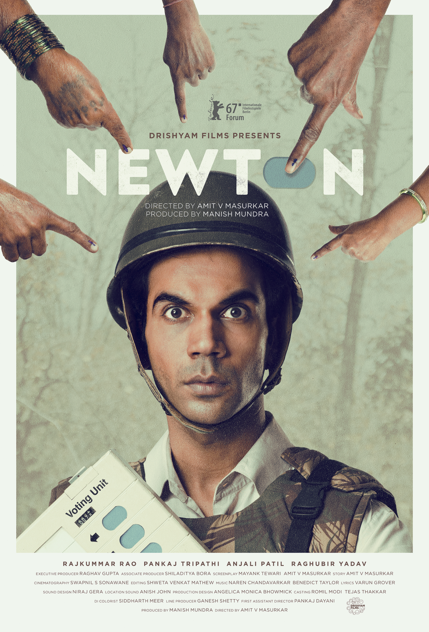
What, at the first look, seems like a number of fingers pointing at a nervous Newton Mishra are of the voters that agreed with Newton’s vision of an elected Democracy. The poster’s 7:3 distribution of the foreground and background element is a graphic treat.
Fukrey Returns:
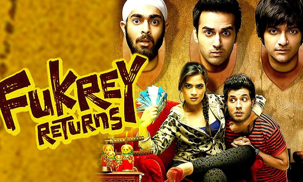
Fukrey came back with double the blast this season and claimed the entertainment that it tickled our guts for the last time. This colourful poster sets the theme of the film as the fukreys being the bait and the banter. The poster also portrays a very important detail about the conclusion of the sequel. Point it out in the comments below.
Ghazi Attack:
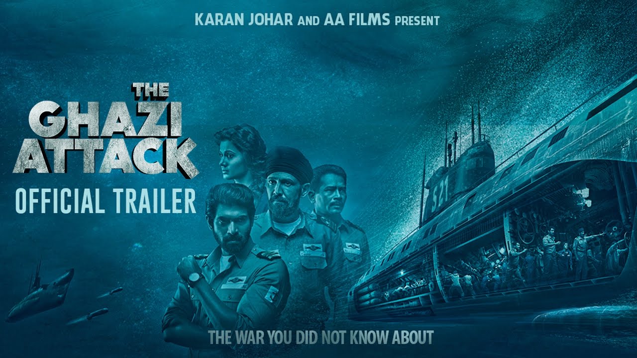
As poster-y, this image may be, I like it for its hue of blue dominating all the other elements including the actors which conveys the patriotic life underwater of a night sky. The tricolour adds subtle details to the poster.
Chef:
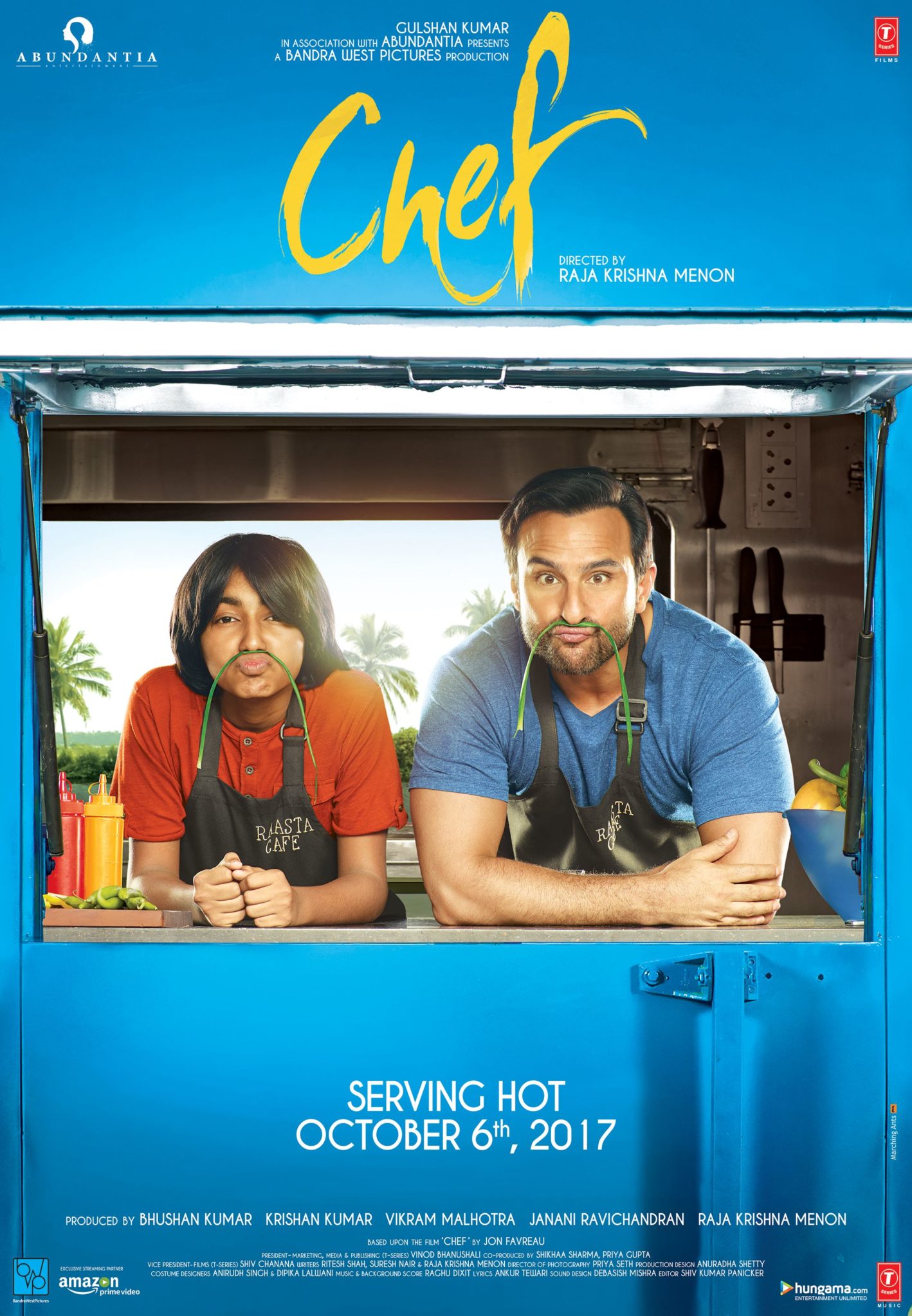
Seemingly notorious and happy, this poster makes anyone want to go watch this Saif Ali Khan starrer for its witty design. It is a graphic eye candy for its yellow font over the dominant blue.
Lucknow Central:
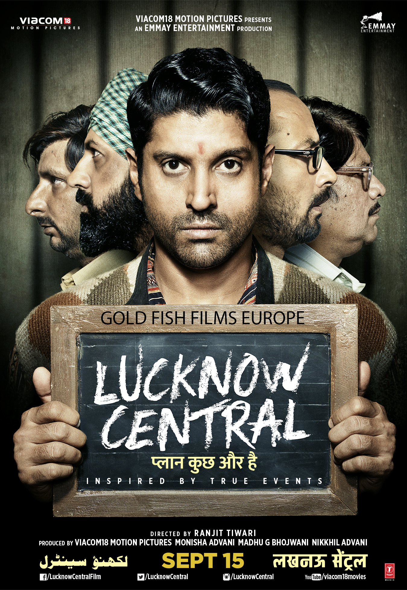
Another Farhan Akhtar starrer based around a passion for music, this one comes with a twist. The musicians all end up in jail and this is what the poster safely implies. With just one line, it conveys how the convicts are not planning to settle for the allegations and forget their dreams.
Frequently Asked Questions
Which Bollywood poster from 2017 won the most awards?
While the article highlights standout designs like Lipstick Under My Burkha and Tumhari Sulu, specific award information isn’t detailed. These posters gained recognition primarily for their creative excellence and cultural impact among audiences and design communities across India.
Why was the Lipstick Under My Burkha poster so controversial?
The poster used the lipstick as a symbol of female empowerment and rebellion against misogyny, which aligned with the film’s bold narrative about women’s independence. The vibrant colors and subtle messaging challenged conventional norms, making it memorable and discussed widely across social media.
What makes Tumhari Sulu’s poster stand out from other 2017 releases?
Vidya Balan’s enigmatic expression and the seductive, playful positioning perfectly captured the film’s essence about a housewife’s secret life. The poster’s composition and Balan’s subtle smile created intrigue, making it rank highly among 2017’s best poster designs for its storytelling simplicity.
How do film posters influence ticket bookings in India?
Strong poster design directly impacts audience perception and booking decisions. A visually compelling poster with clear messaging can communicate a film’s genre, tone, and themes instantly. In India’s competitive cinema market, effective posters remain crucial for generating initial interest and word-of-mouth momentum.
What design trends defined Bollywood posters in 2017?
2017 saw bold color palettes, minimalist approaches with symbolic elements, and playful typography gaining prominence. Posters moved away from cluttered designs toward cleaner compositions that told specific stories—as seen in Aam Aadmi Family’s doodle-style background and Lipstick Under My Burkha’s striking visual statement.
Disclosure: This article may contain affiliate links. VoxSpace may earn a small commission if you make a purchase through these links, at no additional cost to you. This does not influence our editorial opinions or reviews.
You Might Also Like
- [VoxSpace Selects] 12 Posters From Telugu Cinema Of 2017 That Stood Out As The Best Of The Year
- [VoxSpace Life] The Liberty Of Using Movie Posters : What Have Artists Left Behind?
- [VoxSpace Selects] Bollywood Food Scenes That Will Make You Hungry
- [VoxSpace Selects] Avenger's Infinity War Part One Drops It's First Trailer And It's Epic In Every Sense
- u201cITu2019S A FUCKING BLOCKBUSTERu201d u2013 The Sad Delusion That Tollywood Gifts Its Audience
- [VoxSpace Selects] Ayushmann Khurrana - A Study Of The Ultimate Risk Taker of Bollywood
- [VoxSpace Selects] The Indian Cinema Report Card 2017 : A Celebration Of Pure Story Telling


Comments are closed.